APIBridge Tools
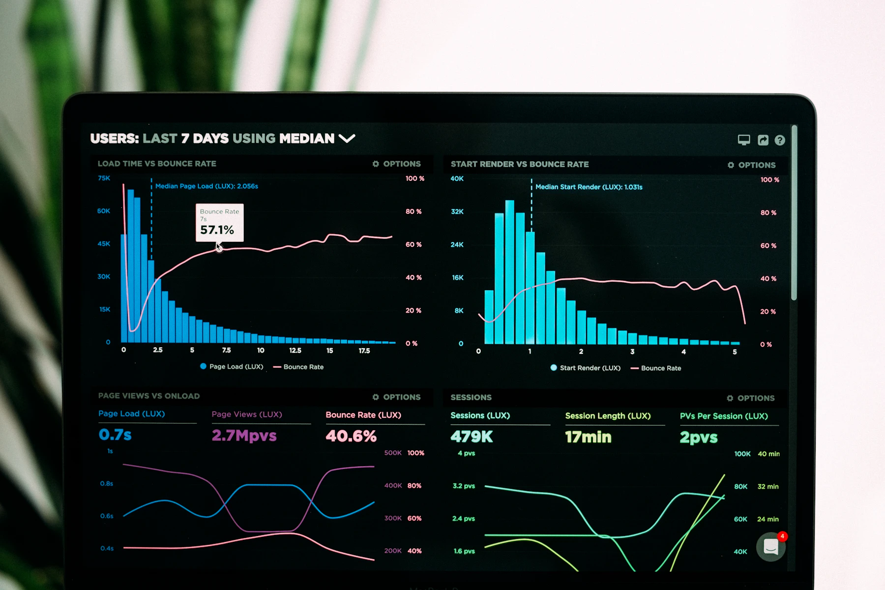
A calm place to learn how to visualize API latency, error heat, and traffic shape — then turn those views into decisions your team will actually use.
What changes
From noisy graphs to shared language
Most monitoring stacks already collect the numbers. The gap is reading them together — request paths, regional outliers, and release windows — without drowning in panels.
Our programs focus on composition: which signals sit on one canvas, how annotations tell a release story, and when a simple table beats a flashy chart.
-
Latency as a landscape
Map p50–p99 side by side so spikes stop looking like random weather.
-
Error heat with context
Overlay status codes with deploy markers and partner dependency notes.
-
SLO reviews that finish
Practice the weekly ritual that turns dashboards into backlog items.
Learners say
Specific wins from recent cohorts
After the Latency Canvas module I finally stopped pasting four screenshots into Slack. One annotated board covers our payment gateway path now.
The course is strong on visual hierarchy. I still wish the CSV import lesson had more edge cases, but our Friday SLO review is shorter by about twenty minutes.
Featured programs
Start where your monitoring pain is loudest
Latency Canvas Studio
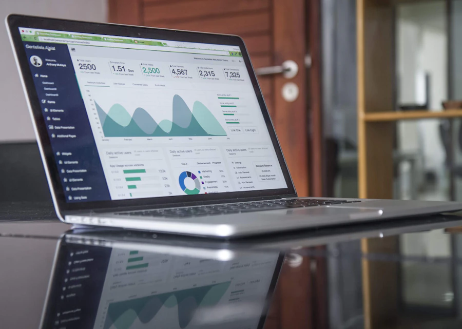
Design a living board for API performance that product and SRE can read in the same meeting.

Error Heat Workshops
Build focused views for 4xx/5xx clusters without cloning every vendor default.

SLO Narrative Clinic
Turn monthly reliability reports into a story with charts that earn executive attention.
Field notes
Numbers from our Malaysia-facing cohorts
Bring a messy API board. Leave with a readable one.
Tell us which services hurt most and we will point you to the right course path — no checkout pressure, just a clear next step.
Talk with us